Notebooks
A few years back, when I was studying Biblical Hebrew grammar for the first time,my brain got stuck on an interesting idea. I found that in my notebook, I would either not leave myself enough room for the vowels under the letters, or I would leave myself so much space for the vowels that I basically putting one page of notes on two pages. What I wanted was notebook paper that was lined to leave vowel space, but not too much. I drew some lines on the computer and printed it out and thought it was good, but could be better. What I really needed was a whole notebook like this to keep things from getting lost and also for doing any larger scale translating projects. The only things I could find were aimed at young learners, so the spacing was bigger than what I was looking for, while the overall notebook was smaller. I looked into companies that make custom notebooks, but they are focused on cover art—custom ruled papers was not something I could find.
I thought that a classic composition book would be perfect—thick boards for the covers, speckled cover art, the reference pages on the inside covers, and enough pages to track a good chunk of text. Making these fully custom would also mean that I could make the informational interior covers focused on the things that are useful for doing this type of work—tables of Biblical/Talmudic measurements, rulers for those measurements, the letters as they appear in different printings, names of the vowels, things like that. Finally I realized if I wanted this notebook to exist, I was going to have to apply my book arts education and make a prototype. After using my prototype for a year and half of Biblical Hebrew and Talmud classes, I am now starting to work on producing these for other people to enjoy.
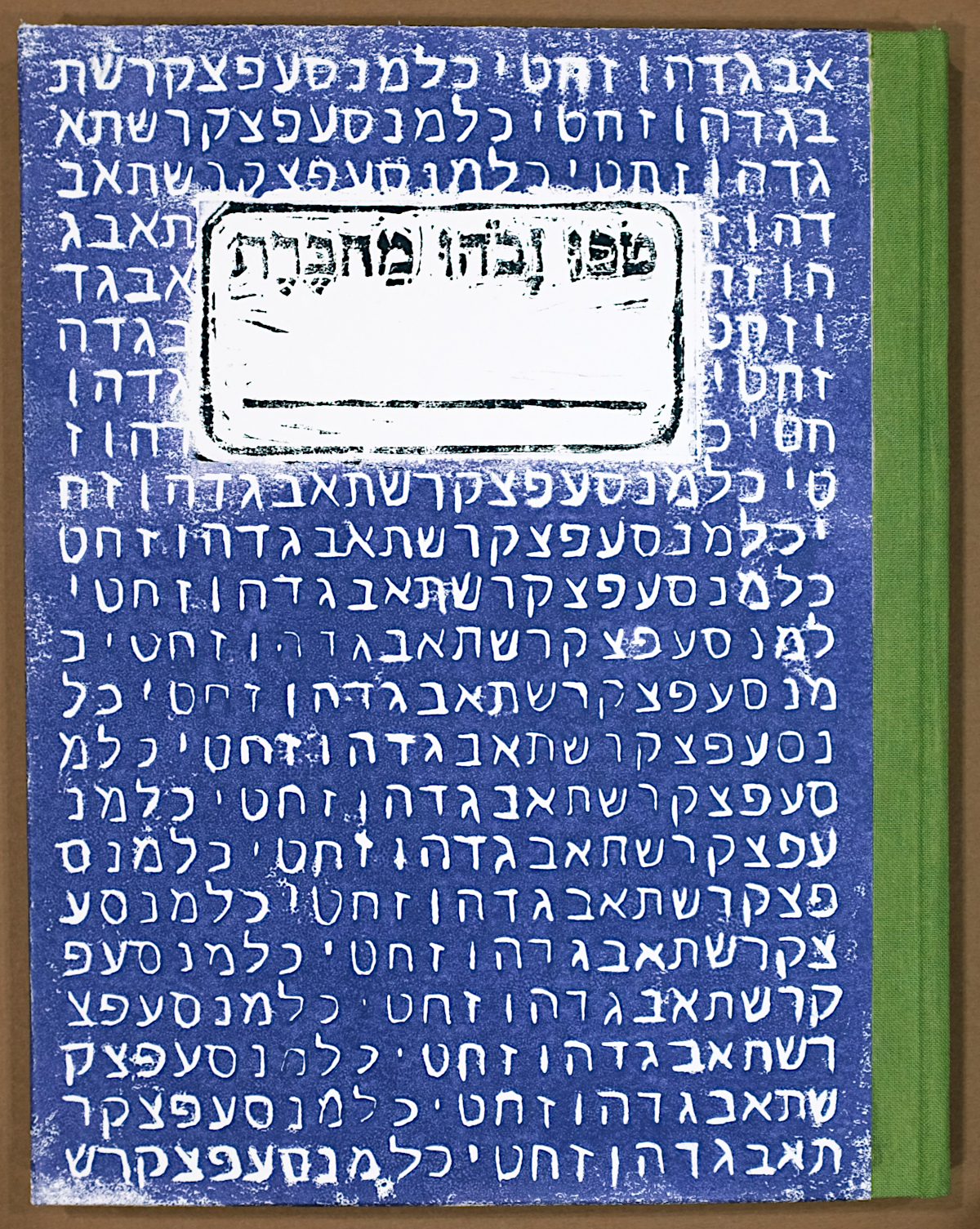
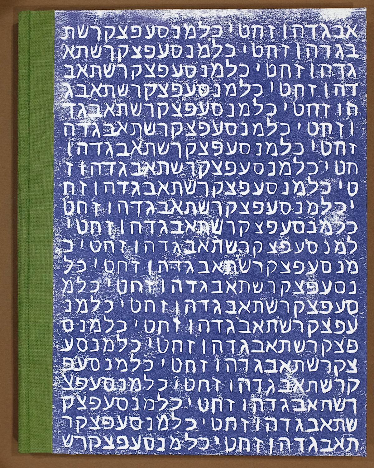
I started working with linocut block prints a few years ago while taking a letterpress printing class. The idea of using it for the covers made a lot of sense to me since it can be done without a lot of equipment, and it could be a nice way of making the speckled covers. My first thought was to do a random pattern, but instead thought a repeating alef-bet might look nice. The nameplate is done as a second print with a separate block on the same page. After making these prototypes I did realize that the word order should be reversed for smichut reasons. A new linocut block has been prepared and is being used in the production version.
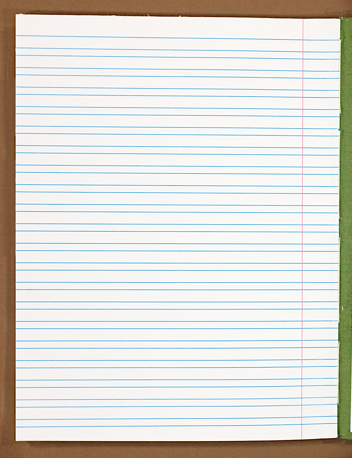
The reason this project exists–classicly styled notebook paper with ruled space for vowel pointing. The prototype paper was produced by a local print shop, who will also produce the paper for production. The paper stock works very well—it has enough tooth to work well with pencil, and is also thick enough that bleed through with fountain pens is minimal.
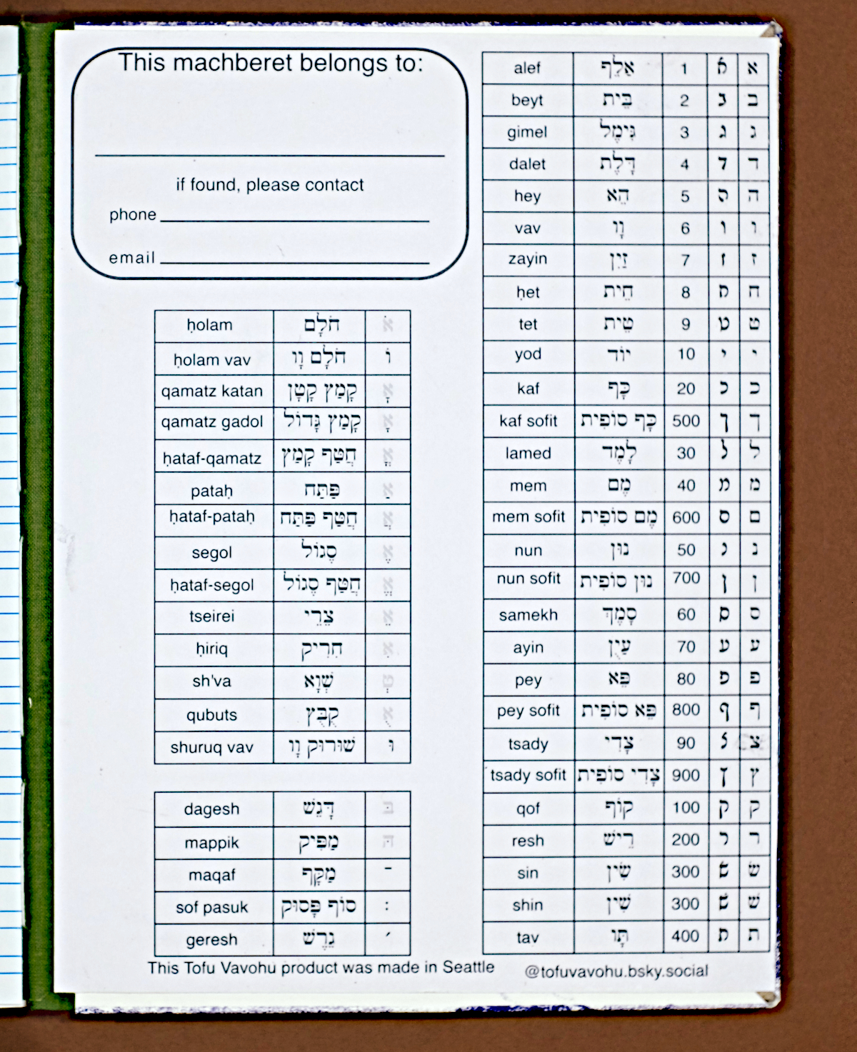
The inside of the front has covers very basic things that are helpful in early learning stages. I definitely did not retain the names of the vowels from my elementary school Hebrew education, and the same is true for many people I have learned with over the years. It is pretty easy to know the alef-bet without necessarily being able to quickly jump to the right part of the dictionary, or knowing the numerical values for finding pages and verses. Reading Rashi script is also not high up on the list of things to learn in B'nei Mitzvah prep, so that is helpful here, and the production version will have modern cursive as well.
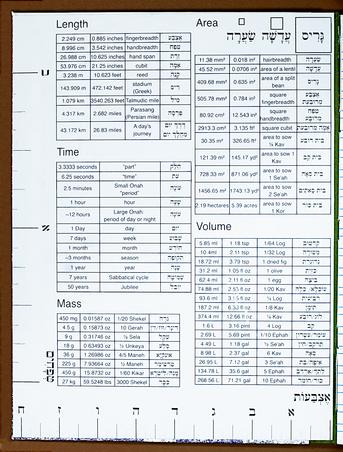
Providing conversion tables for measurements is a pretty standard feature in composition books, so it made sense to provide charts converting to connect with modern measurements. I also find having visual references helpful for these, so providing rulers for length and square diagrams for area. Many talented scholars have offered their best understandings of what these measurements mean (see Torah Calc for more), but nonetheless, these quantities should be taken with a gerah of salt.
The reference pages for the prototypes were made on a home laser printer, but the production versions will be produced by the same print shop as the ruled paper.
The back cover uses the same main block as the front, but without the nameplate. The binding is a pretty traditional adhesive method with spine supports. It lies flat when opened, and the cloth spine ties to the composition book styling. The binding intentionally opens right-to-left.
Current Status
Notebook production is underway now. As of June 5, front and back cover pages for the first handfull of machbarot have been printed and sundry binding materials are on hand. The files for the endpapers and the filler paper have been finalized and submitted for production at a local. Once those materials have been picked up, the folding, binding, pressing, and gluing will begin.
Reach out with the contact form if you would like to get email updates about the machberet.